Tag Archives: Web Design Trends

Web Design Trends: Ideas on How to Customize Your Online Store

People tend to give heavy regards to an aesthetic appeal of a thing. It may be a shirt, a place, or even a wall. These things that have good aesthetics will quickly grab their attention. The same principle applies to different websites, especially in online stores. You need to make your store an aesthetic and beautiful place wherein you would need to present your products and services in a way where your audience and potential customers would never think twice to buy it.

According to Adobe, about 38% of online users will stop engaging with your website if the content and layout is unattractive. This strengthens the claim that web design services are needed to have a significant effect on your store’s sales. This article will give you seven different ways on how to amp up your online store web design and easily gather sales for your business.

Make a responsive web design

image5

What is the sense if your site has beautiful designs, but it does not adjust to your user’s mobile device? It is essential to give high regards to making your site functional and optimized for many different devices. You need to make your online store’s web design a responsive one. Most of the time, these kinds of design will not only give you advantages in making sales and reaching target customers but also contribute to your SEO optimization rankings, which can get you on top of the search engine results pages.

Build trust immediately on the home page

image4

Your home page is one of the most important pages on your website. As may people judge the book by its cover, you need to build a good reputation and impression through your home page. It is the first page the people see when they visit your website, so it is very critical for your site to make it attractive in the best way possible. Other than the attractiveness, you should also focus on introducing your business as well as to build trust among your target customers.

Design an easy-to-navigate category pages

image7

Category and menu pages should have an easy way for the customers to navigate through it. Most of your customers’ time will go in browsing the categories of your store. They can look for different products they need or compare similar products and know what to buy among those. It should have the easiest accessibility to make your visitor’s journey on your website as effortless as possible.

To have a good navigation in your category page, you should first have a well-crafted information architecture, which contains the details on what pages are needed for your category pages and what will have the most appeal to your customers. Lastly, making every category simple and specific at the same time for your customers to easily find what they are looking for. Simple is good but in this case, specified tags would be needed for an easier process for your visitors.

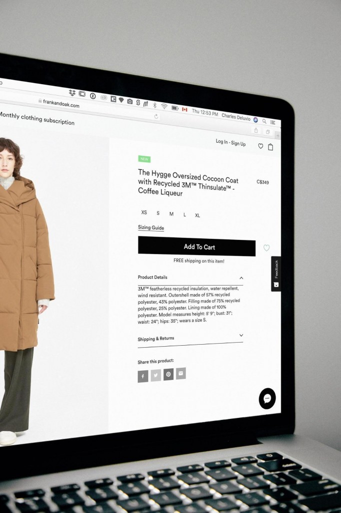
Make your product page eye-catching

image6

After going through category pages, your customers will land on different product pages. The product image and the information with it should be well-presented. The description should be written as specific as possible, and it should be clear and simple to avoid confusion with your customers. The images should easily attract your audience with different features. You can put necessary photos that can help them inspect and see the product from every angle. You can also put powerful zoom to get a closer look for your visitors. In this way, you are giving your customers an easy way to check up on their product before purchasing.

Have a simple view cart page

image2

The view cart page should give every information the customer needs before checking out. It should run as fast as possible and present all information on their list of items. There should be an option to change quantities of their items, view order in total, and also remove items. The shipping fees, taxes, and different fees shouldso be presented on this page. In that way, it can prevent your customers from abandoning their carts, and they can see the full price to pay. Thus, there will be no hidden charges.

Create a seamless checkout page

The checkout page is one of the most critical pages because this is where your customers will decide if they will buy the product or not. You need to make this page seamless and have the best speed for your customers to finish the purchase with minimal effort. All information fields that are required should be apparent for your target customers. If they forgot to answer a specific required field and proceeded to checkout, it should not delete all of their responses and let them start over the process. It should be customer-friendly to avoid losing sales.

Make an accessible account page

image1

The account page should also appeal to your customers because this is where they can see all of their past transactions, and you can target your customers to enforce them to buy more and purchase more in your store. For example, a customer would like to look at his previous transactions so he can buy more of it from your store. You need to provide an easy way to access their information that can give a positive influence in their purchasing behaviors.

Conclusion

Ultimately, your web page design can do a lot for your site, whether it be good or bad. Rather than just dealing with it, turn your web design into an asset. Find the right balance between appealing, unique, and functional to maximize the positive effect it has on your customers and eventually, for your store as well.

Web Design Trends

Top Visual Web Design Trends You Should Follow in 2018

A lot of companies are entering the business with a variety of products and services. All of them require different websites for different kinds of business modules. Website design can play a very vital role in differentiating one from its competitors. So the use of visual design tips and trends are essential.

You need to follow some specific design tips and trends. For example, people prefer images over plaintexts. In all social media platforms, visuals engage and attract more users. So, it is one of the marketing strategies you would like to follow.

These design elements are not constant. They are prone to change and run out of trend. To be competitive, one needs to adapt to the ongoing design trends. An outdated website can never bring the expected results. It is 2018, and you have to think of new design tips and trends for this year. If you are still carrying on with what you did in 2017 or earlier, you are losing the race.

Below goes a list of visual design tips and trends to follow in 2018:

Beautiful and Vibrant Colours

Use of beautiful, vibrant colors attracts users and increases traffic to your site. As traffic increases, so does your conversion rate.

Try different color combinations. That doesn’t mean you have to rethink everything and add unnecessary colors. Just be ready to take some risks
with your colors, and if you have a less exciting site, you should have the courage to bring some changes with colors.

Bold colors have been one of the most common driving forces of this year. But make sure you are also consistent in using colors throughout the site.

Typography

Fonts play a vital role in design. Different fonts have different effects on people just like color schemes. Don’t overlook the importance of typography. It is one of the top design trends in 2018 and for the coming years. Use of appropriate and robust visual fonts help draw the attention of the visitors to specific content.

Nowadays it is the bigger, the better. Designers opt for artistic effects, extra-large font sizes, and huge headlines. You can add some eye-catching handwritten fonts. This is an ongoing trend that has come from the design world moving away from boring minimalism. It is probably going to make you stand out from your competitors.

To produce something on printed material for professional business purposes, go for a classic serif font. For a posh feeling, opt for a thin and long sans serif font.

You can also add color fonts and animated typography. Such diversities can undoubtedly upgrade your presentation that can be achieved through the correct use of fonts. So it would be a poor choice not to give it a thought.

Videos

Consider videos as an integral part of the design elements for your site. They are becoming popular and have already become a reliable marketing tool too.

Creating videos is not that expensive nowadays. You can take help from creative agencies for getting the right type of videos to go with your site.
For example, if you are a fashion design company in New York, your videos should follow the fashion trends in the US market. They should be polished and glamorous while displaying your product range.

On the other hand, if you are a web design agency, your videos should most probably contain client testimonials. They should look authentic and professional.

Placing the video on your site in the right way is also essential. Here’s an example from WebAlive, a web design agency in Melbourne. They use a proper combination of text and video to visually present their client testimonials.

Authentic Images

Authentic Images

Use of images is another design tool that you must use in your website. Use of large images is a new trend which is adopted by many modern websites.
As the amount of contents created each year is rising, the need for quality images has increased too. As a result, some pictures are being overused. If you see a picture for the hundredth time, would you go through the content? I guess, no.

Authentic photography looks and feels real. I guess everyone in your group has a smartphone with a decent camera now. Use it. Or contact a photographer if needed. Keep it real. It helps.

GIFs

Who doesn’t love a gif? Everybody does. In case you are having trouble adding videos and images, you may try GIFs. They are even better if used in the right way. They add versatility. They do not require any special software to run and can be embedded just about anywhere. They are small in size too.

GIFs work as a perfect little conversation that expresses emotion when texts don’t. Instead of using stock images, try creating a GIF investing a few minutes. It has been observed that tweeter tweets with GIFs are two times more likely to be retweeted than tweets with photos.

Cinemagraphs

Cinemagraphs are images that are completely frozen except for a tiny area of subtle movement. They are more like cousins of GIFs.

In 2018 Cinemagraphs can be a great tool to distinguish yourself from others rather than using traditional GIFs. Because of their subtle movement, they are more eye-catching.

Custom Illustrations

The designers are moving towards custom icons and illustrations.

Custom graphics not only make content visually attractive but also makes them look authentic. This naturally brings a good feeling about the content. And creates a first impression that is good for the business.

Conclusion

Being unique in your presentation is a great way to set you apart from others. If you offer your viewers something entirely different, they will come back to you. As people strive for authenticity in their digital life now, this is quite important.

Here are the key points that we have discussed in this article:

1. Use bold colors to attract users.
2. Typography is going to play an important role.
3. Use videos and authentic images.
4. Take help of GIFs and cinemagraphs to drive engagements.
5. If possible, use custom illustrations that no doubt gives you appealing visuals and authenticity.

Hopefully, all these visual design tips are going to give you a kick start in the right direction if you can use them well.